Our Blog
- English
- Македонски

News, Ideas, Inspiration, DIYs, Advices, Products...
05
Dec
2019
Classic Blue is Pantone's colour of the year for 2020
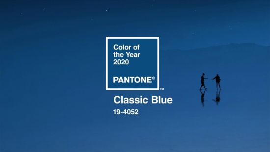
American colour company Pantone has chosen "universal favourite" Classic Blue, or Pantone 19-4052, as its colour of the year for 2020.
Announced 4 December, the Classic Blue colour is described by Pantone as "a reassuring presence instilling calm, confidence and connection".
"Associated with the return of another day, this universal favourite is comfortably embraced," it added.
While this year's colour Living Coral was an "animating and life-affirming", 2020's shade "brings a sense of peace and tranquillity to the human spirit, offering refuge," according to the company.
The cobalt blue hue is also said to be associated with communication, introspection and clarity. Other benefits of the hue include aiding concentration and helping to re-centre thoughts, particularly in light of technology's accelerating developments.
"A boundless blue evocative of the vast and infinite evening sky, Pantone 19-4052 Classic Blue encourages us to look beyond the obvious to expand our thinking; challenging us to think more deeply, increase our perspective and open the flow of communication," said Leatrice Eiseman, executive director of Pantone Color Institute.
"We are living in a time that requires trust and faith," she added. "It is this kind of constancy and confidence that is expressed by Pantone 19-4052 Classic Blue, a solid and dependable blue hue we can always rely on."

Pantone was founded in the 1950s as the printing company in New York but is now based in Carlstadt, New Jersey. Since 2000, it has chosen a colour of the year decided from trend-forecasting research performed by the Pantone Color Institute.
The annual colour, which is announced each December, is chosen based on "what is taking place in our global culture at a moment in time".

According to Pantone, Classic Blue is already being used in fashion, interior design, textiles and graphic design.
Interiors making the most of its soothing benefits are a Paris home by Anne-Laure Dubois, a Los Angeles nail salon, and an apartment in Porto, Portugal by Fala Atelier.
Last year, the peachy shade called Living Coral was chosen and offered a striking addition to bathrooms, kitchens and lounges. A zesty shade of green called Greenery was selected in 2017, while in 2016 Pantone picked two soft colours – a baby blue and dusty pink.
Other annual colours include the purply pink Radiant Orchid announced for 2014, and the bright orange Tangerine Tango in 2012.
Source: